THE PROBLEM
Many people would love to learn a new skill but struggle to find the time, money and motivation to do so. Existing learning resources are either too expensive or difficult to trawl through in order to find quality material.
THE SOLUTION


RESEARCH
So, how did I reach the solution?

COMPETITIVE ANALYSIS
Other learning platforms prioritised REAL people.
I compared 4 existing learning platforms, noting their strengths, weaknesses, similarities, and differences. I identified key features that all these popular learning platforms have.

INTERVIEWS
All of my participants learn better with one-to-one tuition.
I met with 5 participants, 3 in-person and 2 via zoom who had all tried to learn a new skill within the past 3 months. I asked them about their learning style and what works best for them, and certain patterns started to appear.

Participant criteria:
-
Aged 23-58 years.
-
People who are currently learning a new skill.
-
People who are interested in learning a new skill.
-
Regular internet users.
-
Skilled individuals.
IDEATE
PERSONAS
Who are my users?
I gathered my research findings and created two user personas for me to reference for the remainder of the project. This helped me think about the user's needs and not let my own preferences influence design decisions.


IDEA GENERATION
Brainstorming potential solutions.
I generated as many ideas as possible by analysing how other companies are solving a similar problem and by playing with opposites, thinking of 'bad ideas' to inspire good ones. This led me to a couple of potential solutions.


GOALS
Looking at the full picture.
Based on my interview results, I chose to prioritise one-to-one tuition over the community idea. This landed me on the credit-earning system.
As a UX designer, it's important to think about everyone's needs, not JUST the user's. Here, I considered the goals of the user, the business, and technical goals.

USER & TASK FLOWS
Creating the flow of key features.
There were 4 main tasks to outline:
-
Set up an account
-
Book a session
-
Accept a session request
-
Delete account
For these task flows, I thought about the specific steps the user would have to make to achieve each task.


DESIGN
BRANDING
Devloping the SwapWise brand.
I started to develop the brand. I created a moodboard and thought about brand values.

LOGO DESIGN
From sketches to final design.
My logo design started with pages of pencil sketches and turned into a simple and slightly geometric logo. I wanted the logo to illustrated shared minds resulting in good ideas.


UI kit
Putting together the elements.


TEST
I carried out 5 moderated user tests with the same participants whom I interviewed at the beginning of the project. Based on user feedback, I made a few improvements.
PRIORITY REVISIONS
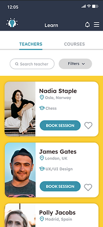
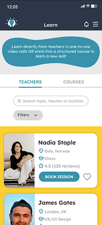

The first changed I made was to write a few lines of text at the top of the ‘Learn’ page which clarifies the function of each tab.
A lot of the feedback I received was confusion over this.

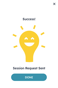
Another change I made was to the ‘Success’ cards. For both booking and accepting a session, I included a message to let the user know what to expect next. This was to reduce the confusion that I witnessed in my user tests.

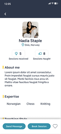
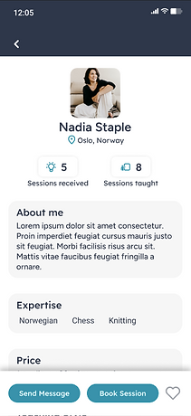

I created clearer sections on the teacher profile page by using a light grey background for each section.
I also included a ‘Price’ section which tells the user how many credits a session with the teacher will cost. Many of my interviewees suggested this.
FINAL PROTOTYPE
REFLECTION
What would I do to improve this project?
There were many potential features to this product that I would have liked to design to enhance its functionality. As it is an MVP, I stuck to the absolutely necessary features, and kept it as simple as possible.
To improve this product in the future I would consider adding the following features:
-
A community in which experts and learners can communicate and form groups that support the ongoing education of users.
-
A direct messaging feature where you can chat with any of your teachers or students.
-
A 'levelling up' feature for teachers starting by just earning credits to becoming paid teachers on the platform.


