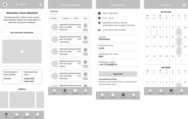
BACKGROUND
Migrateful is a non-profit organisation that runs cookery classes led by refugees, asylum seekers and migrants to help them integrate into society and access employment.
The charity requires a community of volunteers called ‘class sidekicks’ to assist in the running of their various kitchens across the UK. This community of volunteers is called the ‘Orange Onion Club’ and currently use an online portal to organize their volunteer work.

THE PROBLEM

THE SOLUTION


RESEARCH
So, how did I get to the solution?
Research Goals
1. Understand how other non-profits are tackling the task of retaining and educating volunteers.
2. Discover the pain points of the users of Migrateful's current online booking portal.
3. Uncover what is working well with the current online portal.
COMPETITIVE ANALYSIS
Other small non-profits struggle to tackle this problem.
I started by analysing the problem space. I struggled to find small non-profit organisations that had user-friendly apps with simple shift booking systems.
After further online research, I narrowed this down to the fact that small non-profits tend to have small teams and small budgets so often prioritise other things.

INTERVIEWS
My participants could not find the volunteer handbook.
Testing the current online portal revealed several usability concerns. The biggest issue being that the information needed by volunteers to know how shifts work was hard to find.

I conducted moderated usability tests with 5 participants for the current online portal. Each test lasted 20-30 minutes. All participants already had some familiarity with Migrateful (either as a volunteer or a class participant).
IDEATE
Choosing core focuses for the app.
At this point, I gathered my research and thought about the key problems I was trying to solve. I also had to consider what was and wasn’t working with the current website, and how could it be improved in an app?

FEATURE SET
Prioritising potential solutions.
Based on my research findings and keeping these ‘how might we’ questions in mind, I put together a feature set for the Orange Onion Club app. I split the app’s potential features into ‘must- haves’, ‘nice to haves’, ‘surprising and delightful’ and ‘can come later’.
As this is the MVP, I only included the must-haves and nice to haves in my app design.

SITE MAP
Keeping the app simple and intuitive.
I then laid out the structure of the application and its features.
I wanted to make it as simple and intuitive as possible. From the research I had done, I knew it was important to keep the information about how classes work at the forefront of the app.

TASK FLOWS
Creating the flow of key features.
There were 4 main tasks to outline:
-
Sign up
-
Take the quiz
-
Book a class
-
Cancel a class
For these task flows, I thought about the specific steps the user would have to make to achieve each task.

DESIGN
UI COMPONENTS
Elevating the Migrateful brand.
I took the existing Migrateful and Orange Onion Club logos, and built the app’s style tile and component set around them and the existing brand.

TEST
I carried out 5 moderated user tests with the same participants whom I interviewed at the beginning of the project. Based on user feedback, I made a few improvements.
PRIORITY REVISIONS

-
Added an image of a class to the top of the screen to welcome the user.
-
Welcomed the user by name rather than 'class sidekick' to make it more personal.
-
Created a carousel of 'what happens in a class' as test participants wanted more in-app information.
-
Changed the colour of the selected location so that there is more contrast.
-
Added a description of what this selection means for the user in the app.


-
Changed the main buttons to minimise distraction and make them look more like clickable buttons.
-
Changed the 'take the quiz' button to a secondary button for consistency throughout the product.
FINAL PROTOTYPE
REFLECTION
What would I do to improve this project?
There were many potential features to this product that I would have liked to design to enhance its functionality. As it is an MVP, I stuck to the absolutely necessary features, and kept it as simple as possible.
To improve this product in the future I would consider adding the following features:
-
A shift swapping service, making it very easy for volunteers to find cover if they can’t make a shift.
-
A Migrateful forum for the community to share news, updates, and feel like more of a community.
-
A direct messaging feature so that volunteers can contact facilitators via the app instead of facilitators having to share their personal numbers.


